- Read Tutorial
- Watch Guide Video
So, let's start by building that out. I think that it makes sense to come into Visual Studio Code and create a grid style file. So, if I go to our main style file and let's say that we should put this right under button.
main.scss
@import "./variables.scss";
@import "./mixins.scss";
@import "./base.scss";
@import "./forms.scss";
@import "./button.scss";
@import "./grid.scss";
@import "./navigation.scss";
@import "./portfolio.scss";
@import "./portfolio-manager.scss";
@import "./portfolio-form.scss";
@import "./portfolio-sidebar.scss";
@import "./auth.scss";
So, I'm going to create one just called grid and all of our grid related styles can go here. So let's copy this file name and then create the style file in the same pattern that we've been following throughout this entire course. And inside of here, I'm going to create a few of base classes. So I'm going to have one that says one column and then I'm going to create a few others so this one's going to say two column and then this last one, as you may have guessed, is going to say three column.
grid.scss
.one-column {

}

.two-column {

}

.three-column {

}
I'll hit save here and then save and then close out our main style file. So what this is going to do is it's going to give us a CSS class that we can simply call. It will have CSS grid built into it and it will tell us if we have a one column grid, a two column grid, et cetera. So with this one column, what I would like to do is to say display grid and then grid template columns and then let's make this just 1fr because we only want that one column, and then I'm also going to add some grid gap of pixels.
And then we're going to copy this for columns two and three. The only difference is going to be that we have a breakdown so we have additional fractional units so two column should have two columns listed and three column should have three and if we have anymore then they will follow that pattern.
grid.scss
.one-column {
  display: grid;
  grid-template-columns: 1fr;
  grid-gap: 21px;
}

.two-column {
  display: grid;
  grid-template-columns: 1fr 1fr;
  grid-gap: 21px;
}

.three-column {
  display: grid;
  grid-template-columns: 1fr 1fr 1fr;
  grid-gap: 21px;
}
Now from here, we need to be able to call these columns. So I'm going to come into portfolio form, down to the JSX and let's organize these. So we already have our portfolio form wrapper here. Now, if you remember when we created this, we wrapped the inputs into div's, so we already have half of our work done for us. So, I'm going to say div, className equals, this is going to be two-column because this is going to wrap up the name and then the URL.
And then our next grouping and you can check the html, you can check the page here for what we're looking to do. If you look at the final version, this is going to be two columns so name, URL's two columns, position and the category is going to be another two column grid. Description's going to be in a one column grid because it's taking up everything and then we're going to have three columns for our three thumbnails. So, let's go and let's keep adding those.
So, we have two columns here, we're going to have two columns down below then we're going to have for our text area, this is going to be one column and I'm copying these just to save time. And then lastly, we already have image uploaders here, what we can do is add on so we can chain this on and say three column, hit save and let's see what we have. Okay, this is starting to look a little bit better, it still needs some work but so far, not too shabby.
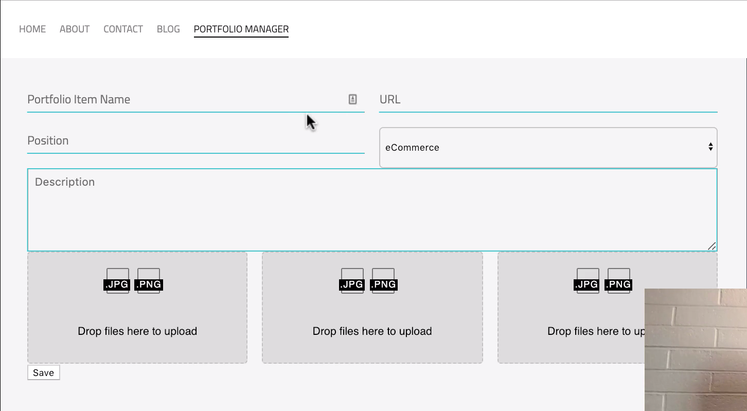
So we have our grid broken out the way that we'd expect and then we also, though if you notice, we have too much space right here which is why it's stretching this select field and we don't have enough space between some of these other elements.
So what we can do is, there's two things we can do. First we can open up the portfolio form and this is the portfolio form styles I should say and let's add some grid gap here as well. So I'll say grid gap same thing 21 pixels, hit save, that's going to spread it out.
And to fix this select field, what it's doing is it's picking up the bottom margin that we gave inside of our mixin. So if you open up our mixins file and you look down at the input elements, you remember how we had this margin bottom? Well I like having that margin bottom. Typically, I do want my inputs to have that but in this case, we want to override it.
So what we can do to override this is inside of the portfolio form right under where we call input elements because of the cascading nature of CSS, I can simply call input and then say I want the margin bottom to be zero pixels and it will override that value. And now you can see that that's fixed and now our select field is looking great. So that is all that we had to do.

We now have our name, URL, position, each one of those in the right spot. Now, in the next guide, we're going to do a few more clean up items such as updating the button and then also, as you can tell right here, we have these images taking up or these image dropzone boxes taking up the full equal space from left to right. You may feel like that's what you want to keep it as but I'm going to also show you how we can shrink those down. So in the next guide, we're going to finish up the entire form.