- Read Tutorial
- Watch Guide Video
They're so closely aligned together right here, it's kind of hard to see where the inputs are and that'll give us a little bit of a break. This also kind of follows a pattern that I personally like to follow whenever I'm building out an application, is I will mix in some design element such as taking a break to implement a design which is a little bit easier to do than say implementing a challenging feature like building an image uploader or anything that I haven't done before and so, this is how I like to break up my personal development day is by mixing these kinds of things in, so I'll do it in this course as well.
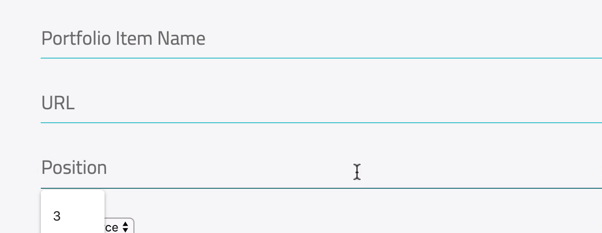
So, what I would like to do is to take all of these ugly inputs and I'd like to create a better-looking input, maybe something that looks more like what we have right here

where it has this bottom border, it's this teal bottom border and everything looks a little bit cleaner and then I also want it to be able to be populated on places like our auth form, so if I sign out and go to auth, you can see we also have that same ugly sign in a set of forms right there.
So what I am gonna wanna do is to build something that can be shared and your very first thought might be and hopefully is that that is a great spot for a mixin. If you want to take a piece of design and you wanna be able to share it across multiple classes and in multiple locations in your application, a mixin is a great use case for that. So, let's start, and let's build that out.
I'm gonna open up Visual Studio Code here and let's just add a wrapper div and in fact, let me clarify, I actually wanna get rid of this wrapper div and instead I wanna use the form as the wrapper, so there's no need to have this div that all it does is wrap up a title and a form, so I can get rid of this top div and the title and then come all the way down and get rid of the closing div tag.
So now the portfolio-form does what its name implies and that is is it a form and it wraps up and returns a form component, so that is all we need to do there and I'm gonna add to this form component a class. So, I'm gonna give it a className and for this let's just call it something like say portfolio-form-wrapper and that's all we need to do in this guide for our portfolio-form.
Now, what we need to do is create a portfolio-form set of styles, so if you open up main, you can see we have a portfolio-manager dedicated style file but I think it makes sense to also have one that is dedicated just to the form itself since we are gonna be adding quite a few custom styles.
So, I'm gonna say portfolio-form.scss and then before we save it, as usual, let's come and let's actually create the file in here, so portfolio-form and that's gonna be an SCSS file and now that we're inside of it, let's actually add that portfolio-form-wrapper.
portfolio-form.scss
.portfolio-form-wrapper {

}
Once I hit save, I can hit save in main and now we can start working with it. Now, you may say, I thought you were gonna build a mixin and I am, I just wanted to create a place where we can call that mixin 'cause if you remember, a mixin is a prototype, it's like a model for a design but it has to be called from some other style file, so that's what we've done here is we have this portfolio-form-wrapper and this is what's going to call our mixin.
Now, let's first add a first base styles in here. So, I want this to use a grid layout and for right now let's just make it so everything's spread out and nice and even, so for here, I'm gonna say grid-template-columns: 1fr. Eventually we're gonna break it into nested columns but for right now, we can just have them all stacked on top of each other and let's add some padding, so we'll say padding of pixels.
portfolio-form.scss
.portfolio-form-wrapper {
  display: grid;
  grid-template-columns: 1fr;
  padding: 42px;
}
Now let's verify that that is all working and yes, we do have our padding and as you can see, these items are stacked on top of each other but once we actually wrap all of these up, they're actually gonna take up all of this space like we're looking for.

So, now that we have that, let's open up our mixin file and then come all the way down 'cause this is gonna be a decent amount of code, remember, we created a mixin for our button which we will use in a little bit but for right now, let's create a new mixin and this one's going to just be called input-element and then inside of here, remember, we have to place the selector.
So I'll say input and then let's give it a custom font-family, the one that we have, let me open up our index.html file 'cause I forget how to spell it. It's this Titillium+Web I believe, yes, so let's copy that, close it out and also put Titillium+Web all inside of a string and then instead of that plus sign, just leave that space.
So I'm gonna say Titillium Web and then as a backup, we'll say sans-serif and let's give it a color of charcoal and then we'll add a little bit of padding, so we'll say five pixels on the top and bottom, no pixels left and right and we'll talk about why in a little bit.
For the width, let's go with 100%, we want these to stretch all the way from left to right, and then I do not want a border-top, so my border-top should be zero pixels. My border-right should be zero pixels, my border-left should be zero pixels but then my border-bottom, remember, we wanna have that cool little line on the bottom to show where the input is, so with this border-bottom, let's make this one pixel, solid and then we're gonna have it use the teal color.
Then after that, let's see, we wanna have a background-color, and for this we want it to be transparent, so if we have it on a different colored background, then it shouldn't have that traditional white background, it should simply show the blue line. Everything that we're doing here is just to show that teal line at the very bottom and then for transition for any kind of animations, let's go with 0.5s, so half a second for all of them and then ease-in ease-out and after that, we'll make the font-size slightly bigger, so 1.1em, and then add some margin to the bottom and let's say it's gonna be 21 pixels, hit save and this by itself doesn't change anything.
mixins.scss
@mixin input-element {
  input {
    font-family: "Titillium Web", sans-serif;
    color: $charcoal;
    padding: 5px 0px;
    width: 100%;
    border-top: 0px;
    border-right: 0px;
    border-left: 0px;
    border-bottom: 1px solid $teal;
    background-color: transparent;
    transition: 0.5s all ease-in-out;
    font-size: 1.1em;
    margin-bottom: 21px;
  }
}
Remember, we have to call this, so copy input-element and now inside of our portfolio-form-wrapper, remember the way we can call a mixin is to say include, then the name of the mixin, then parens and that should bring it in.
@include input-element();
So, let's switch to Google Chrome and yes, that is looking much better.

Notice how we have this cool blue line, it's stretching all the way instead of the ugly HTML inputs we had before. Now, if I click on this, do you see the gray bar, the gray border that goes around that? That is the default HTML behavior and I do not like it, I think that's pretty ugly.

Thankfully there's a way of getting around it, so let's update our mixin again, so inside of the input, so you need to be able to nest this, we're going to add a pseudo-selector, so say ampersand colon and it's not actually hover, no, this is gonna be focus and you can say that you want the outline to be none but we do wanna make sure that we still keep the border-bottom. So I'm gonna say border-bottom and then this is gonna be one pixel, solid and then we're gonna add a dark-teal.
&:focus {
  outline: none;
  border-bottom: 1px solid $dark-teal;
}
So what this is going to do is any time someone clicks on the input, it's actually gonna change the color, it's gonna change the color from teal to dark-teal, to show a cool little animation with that, so let's now hit refresh and now you can see that that is no longer there, that ugly kind of hovering box is no longer there but when I focus, do you see how, it's kinda hard to see without zooming in and we can zoom in a little bit.
So when I click on it now, now the border changes, that bottom border changes very slightly.
Some of my favorite animations, a typical way that I work with animations is to make them as subtle as possible. So, what we have here is a nice dark teal as opposed to the regular light one there. Just add a little bit of distinction, so I'm going to zoom back out and I'm really liking that, I think that looks really good. So, now that we have that, in the next guide, we're gonna start updating some of these other fields.